07 · Web design
ORSEN
La matière avant le décor.
Art direction · Design system · Web design & development · B2B portal & quoting · Motion design · Responsive engineering
The intent
Plate-based sections, one signal colour, one typeface. The restraint is the brand.
A materials house selling marble, natural stone, concrete, wood and metal to architects — an audience that reads specification sheets, not marketing copy. La matière, tenue du premier trait à la livraison.
So the layout is built on plates: flat blocks of anthracite and blanc cassé that butt against each other at a 2px radius with a single hairline. Nothing floats, nothing glows, and the type is Satoshi and nothing else — one family carrying display, navigation and specification tables alike. The only colour that ever interrupts is the rouge signal, and it only ever means action.
Behind the public catalogue sits a full espace pro: catalogue, clients, commandes, devis and stock, with an admin role on top. Architects browse and build a sélection; the trade side runs the orders.
- Client
- ORSEN
- Year
- 2026
- Discipline
- Web design
- Stack
- React · TanStack Start · Tailwind v4 · Motion · Supabase · Vercel
Live build
Desktop & mobile
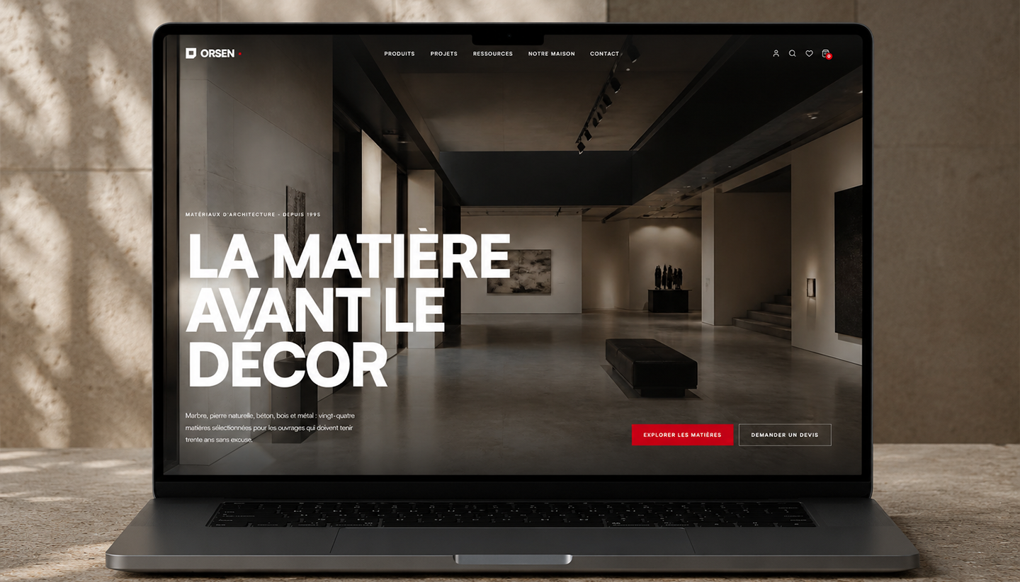
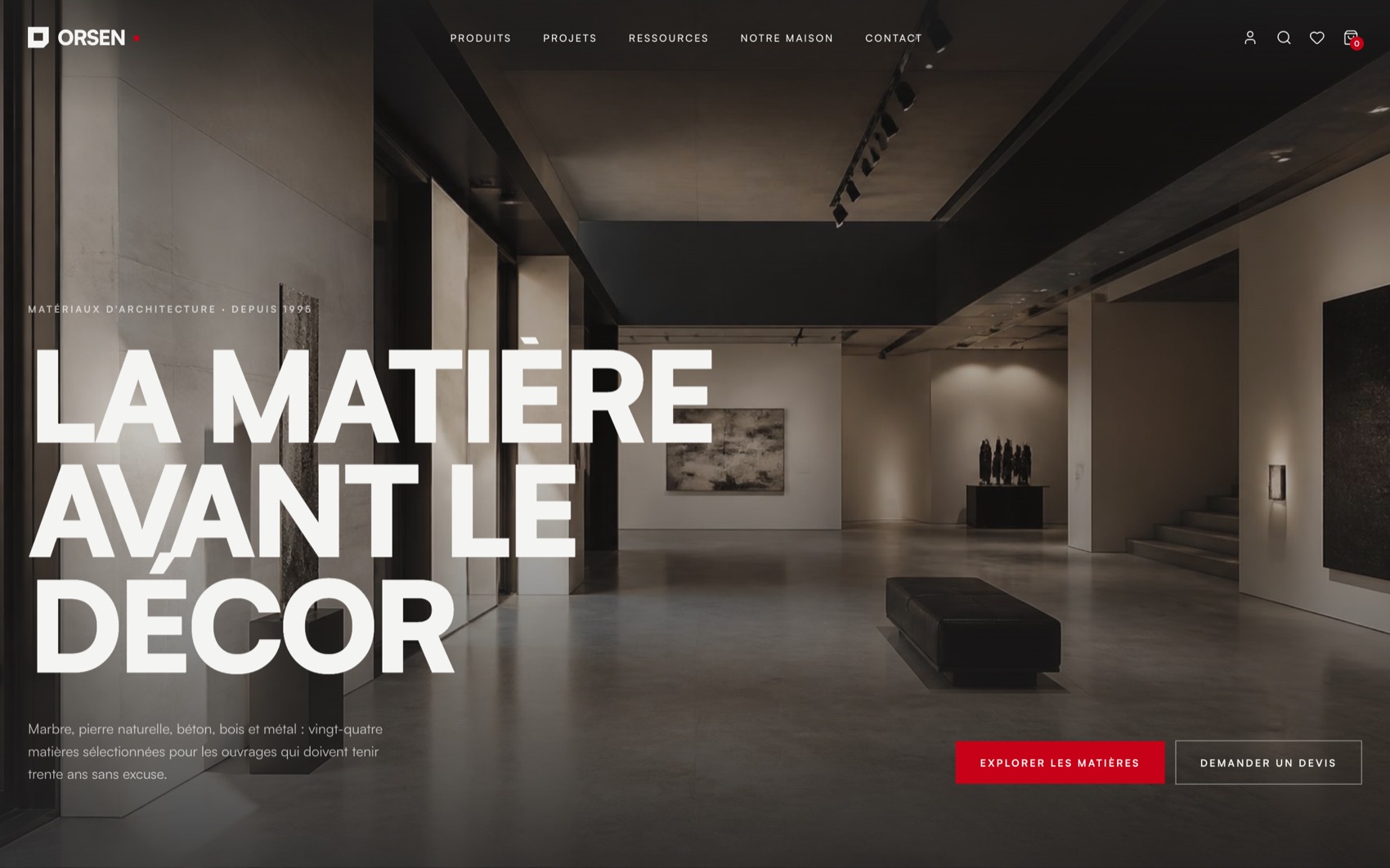
Both frames below are the real deployed site, running live. Scroll inside them.
- 01
Desktop holds the editorial grid with full-bleed plate sections and a persistent search, favoris and cart rail.
- 02
Tablet collapses the material families to two-up and moves search into a full-screen overlay.
- 03
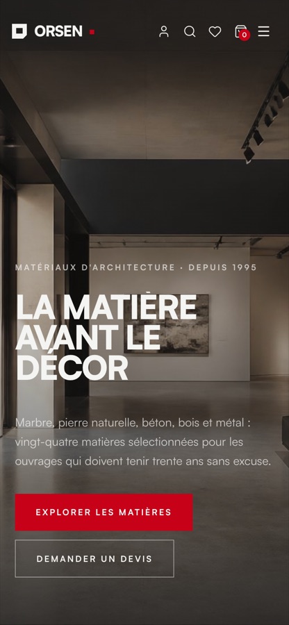
Mobile drives everything from a full-screen menu, keeping demander un devis reachable from any surface.
Design system
Palette & type
Blanc
#FFFFFF
Cards
Blanc cassé
#F6F5F3
Page ground
Gris clair
#E7E6E3
Secondary / borders
Gris moyen
#B9B8B4
Muted type
Anthracite
#232323
Ink & pro sidebar
Rouge signal
#C81E2C
Action only
- DisplaySatoshiBlack weight, tight tracking, set in oversized uppercase slabs that break across the viewport.
- InterfaceSatoshiMedium and semibold for navigation, specs and the espace-pro tables. Satoshi uniquement — one family, full range, no second voice.
Motion
How it moves
- 01
Editorial easing
A single --ease-editorial token, cubic-bezier(.16, 1, .3, 1), drives every transition, so the whole site decelerates with one personality.
- 02
Reveal & stagger
Shared Reveal / Stagger / RevealItem primitives wrap each block, so sections and their children enter on one rhythm instead of per-component guesswork.
- 03
Magnetic links
Primary calls to action drift toward the cursor on approach — the only playful gesture in an otherwise deadpan interface.
- 04
Colour-blind-safe data
The chart pair is validated rather than chosen: ΔE 10.3 apart in light, 8.7 in dark, contrast ≥ 3:1 on both surfaces. A third chromatic tone was rejected because amber and red collapse under deuteranopia, so 'attention' carries a neutral hue plus an icon.
Page architecture
- 01Hero — la matière avant le décor, with explore and quote CTAs
- 02Notre parti pris — the sourcing position
- 03Cinq familles — marble, stone, concrete, wood, metal
- 04Choisir par l'effet — browse by finish rather than by SKU
- 05Sélection du moment, then six matières à voir de près
- 06Réalisations — the projects reference wall
- 07Passer au chiffrage — quote request, favoris and sélection
- 08Espace pro — catalogue, clients, commandes, devis, stock, admin
Next projects
All projects →