09 · Web design
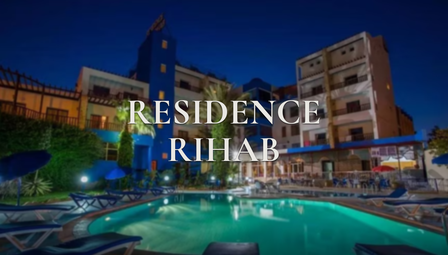
Résidence Rihab
A quiet Moroccan address, five minutes from the Atlantic.
Art direction · Design system · Web design & development · Booking experience · Bilingual EN/FR build · Responsive engineering
The intent
Editorial serif, navy-and-cream, a booking bar that never leaves the viewport — and two languages that are not translations of each other.
Forty-nine spacious apartments in the calm of Cité Founty, five minutes' walk from the Atlantic. Family-run, honestly priced, unmistakably Moroccan — and every competitor site in Agadir was selling that as five-star luxury it never claimed to be.
The design leans into honesty instead: a navy, steel-blue and off-white palette that answers the building's own blue-and-white, a Fraunces serif that reads editorial rather than corporate, and photography left uncropped and unfiltered. The guest words on the page are real ones, staff named — Suleiman and Mahdi looked after us like family.
Underneath it is a working reservation system, not a contact form: rooms, rates and availability live in Postgres, guests book straight from the site without an account, and the family manages rooms and reservations from an admin console behind a role check. It still never asks for a card.
- Client
- Résidence Rihab
- Year
- 2026
- Discipline
- Web design
- Stack
- React · TanStack Start · Tailwind v4 · Motion · Lenis · Supabase · Vercel
Live build
Desktop & mobile
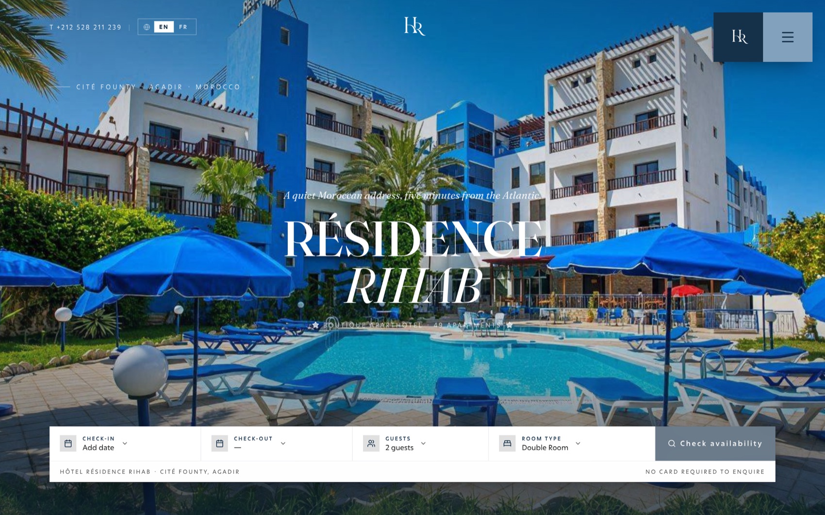
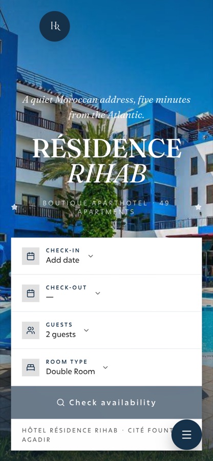
Both frames below are the real deployed site, running live. Scroll inside them.
- 01
Desktop lays the availability bar as a five-field horizontal strip over the hero, with a dark forest mega-menu for the four nav groups.
- 02
Tablet wraps the bar to two rows and keeps the search button full width.
- 03
Mobile converts it to a single tap-to-open sheet pinned to the bottom safe area.
Design system
Palette & type
Forest
#153149
Primary
Forest deep
#0D2033
Mega-menu ground
Sage
#81A1BC
Secondary
Sage soft
#CCCCCC
Accent
Cream
#F7F6F0
Page ground
Sand
#D5D5D5
Dividers
Ink
#222222
Body type
Ink soft
#555555
Muted type
- TitleFrauncesOptical-size serif at weight 500 for the hero and every section heading, italic for the standfirst.
- DisplayTankerThe heavier display cut behind h1–h4, set at -0.01em tracking.
- InterfaceExconThe body grotesk for the booking bar and forms, with ss01 and cv01 stylistic sets on throughout.
- AccentTelmaA calligraphic serif kept for the rare flourish, never for anything a guest must read to book.
Motion
How it moves
- 01
Slow hero settle
The hero image scales gently to rest while the standfirst fades up — a single breath before the booking bar arrives.
- 02
Availability bar
Docked over the hero, then it detaches and sticks on scroll. On mobile it collapses to a tap-to-open sheet in the bottom safe area.
- 03
Tone-aware language switch
The EN/FR toggle is sharp-cornered to match the header's square brand blocks, and restyles itself across three grounds — translucent white over the hero photo, forest ink on the scrolled cream bar, sage inside the dark forest mega-menu.
- 04
Framed depth
Two shadow tokens do all the lifting: a deep --shadow-frame for hero and room imagery, a shallower --shadow-card for everything else.
- 05
Two languages, not one translated twice
The French is written, not translated. It carries a warm Gadiri voice for French-speaking and Moroccan families, and the navigation is re-conceived rather than converted — 'Rihab' becomes 'La maison', 'Visit' becomes 'Nous trouver'.
Page architecture
- 01Hero with availability bar — check-in, check-out, guests, room type
- 02The house — 49 apartments, family-run, five minutes from the Atlantic
- 03Stay — double room, studio, 1-bedroom and 2-bedroom apartments, rates in MAD
- 04Comforts — pools & terrace, hammam & spa, restaurant & rooftop bar
- 05Gallery and real guest reviews, staff named
- 06Visit — Cité Founty, Agadir, and what to do nearby
- 07Reserve — dates, guests, nights and total priced live, no card required
- 08Admin console — rooms, rates, availability and reservations behind a role check
Next projects
All projects →